I need as many opinions as possible!!!

Collapse

Ad

Collapse
X
 
  • Time
  • Show
Clear All
new posts
  • The_Blunt
    Officer
    • Jul 2007
    • 1822
    • DSA Blunt

    I need as many opinions as possible!!!

    Hey guys. Sorry I haven't been around these past couple of months.
    After beating AC3, I started to get really sick of XBox games and decided to take a break.
    If you've seen me on Halo Reach it's because I'm entertaining my girlfriends little brother.
    But I still love you guys and I do plan on returning one day in triumphant fashion.

    Anyway, my girlfriend is in a hard rock band called This Dark Day and their EP is nearly finished.
    It's been up to her to design/draw all of the lyric pages and the cover.
    So she did that and the drummer kept asking her to change the cover to his liking.
    She redesigned it twice for him and she was under the impression that they thought it was good...
    until Saturday when they came at her with words such as "This cover is too girly", "If somone my age (35) saw this cover they would just say 'this shits gay' and throw it away without listening to the songs"
    and "I can't really see this cover on a T-Shirt".
    This, understandably, really hurt her feelings because she put a lot of hard work into it and is really proud of it.
    She's not very good with confrontations so she just sat there with a really hurt look on her face while taking all this heat from them.
    This, understandably, pisses me off. The fact that they think having a heart on it makes it "girly" or "gay" is a very Middle School-ish way of thinking, in my opinion.
    So I feel like it's my job to defend her artistic integrity and get them to use her original work. So I come to you guys for your opinions.

    So the questions I guess I'm asking are:
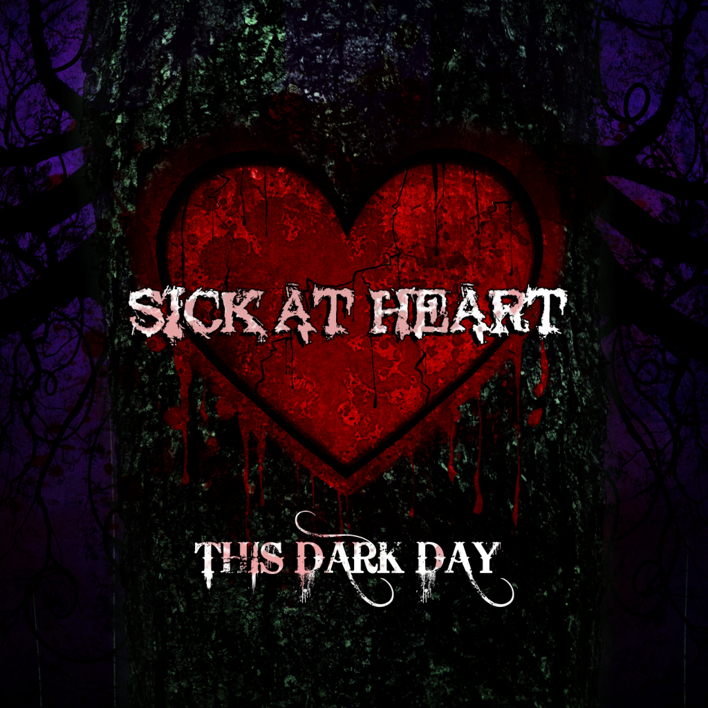
    1. Do you think this cover is "too girly"?
    2. Would you not want to listen to this album if this was the cover?
    3. Would you give 2 flying facks what people think if you liked the band and wore this on a shirt?

    This is the cover:


    And this is their best single so far, Takes Me Whole (or Takes My Hole as us perv's like to say)


    So everyone, whether you're 360, PS3, just a site visitor, whether you like me or hate me, just give me your opinions.
    Please be honest. Don't say what I want to hear just because I'm trying to defend her.

    P.S.: Before anyone says it, I know my girlfriend has a really nice big butt. It's one of the many reasons why she's my girlfriend. ;)

    Thank you.
    sigpic
  • Kamui
    Imperial Advisor

    #2
    I thought you didn't like us anymore!, naw i'm kidding I understand what you've been up to.


    1. Do you think this cover is "too girly"? Nope
    2. Would you not want to listen to this album if this was the cover? I like what I choose so yea I would listen to it regardless. The color scheme. letters fit perfect, there is no imbalance there.
    3. Would you give 2 flying facks what people think if you liked the band and wore this on a shirt? I generally don't give a shit what people think about me. This world is too damn opinionated!
    <a href="http://s11.photobucket.com/user/dsaBOSS/media/mui_sig_zpsdfb059b2.png.html" target="_blank"><img src="http://i11.photobucket.com/albums/a178/dsaBOSS/mui_sig_zpsdfb059b2.png" border="0" alt=" photo mui_sig_zpsdfb059b2.png"/></a><a href="http://psnprofiles.com/XxkamuixX1"><img src="http://card.psnprofiles.com/1/XxkamuixX1.png" border="0"></a>

    Comment

    • Light496
      Stormtrooper

      #3
      1) the covers cool
      2) I would still listen to it regardless if I though it was too girly. The song makes the song good not the cover, that's what I think at least.
      3) I generally don't really care what most people think so I would wear the shirt
      sigpic

      Comment

      • nd32479
        Imperial Advisor
        • Aug 2009
        • 1944

        #4
        1. Do you think this cover is "too girly"? A little, but given you have a female lead singer...that may be a bad thing. The design is not bad. But I do find that type of heart is more emblematic of Valentine’s Day and love. Perhaps a more anatomically correct heart would evoke the more masculine and dark edge the rest of the band is going for. Although, it sounds like the band is not really providing much direction what they want, but rather just crapping on the ideas she is coming up with for the cover. That can be frustrating for any artist.
        2. Would you not want to listen to this album if this was the cover? If I knew nothing of the bad, I would probably not take interest based on the cover. However, if I knew of the band...I would not care what the cover was like.
        3. Would you give 2 flying facks what people think if you liked the band and wore this on a shirt? I don't really wear concert teeshirts, so it is hard for me to say. But if I like something, I like it regardless of what people say.
        ND

        PS3 ID - x__ND__x

        XBOX Gametag - DSA x ND x


        ...So live, that when thy summons comes to join
        The innumerable caravan, which moves
        To that mysterious realm, where each shall take
        His chamber in the silent halls of death,
        Thou go not, like the quarry-slave at night,
        Scourged to his dungeon, but, sustained and soothed
        By an unfaltering trust, approach thy grave
        Like one who wraps the drapery of his couch
        About him, and lies down to pleasant dreams.

        William C. Bryant

        sigpic

        Comment

        • jakewill
          Honorary DSA
          • Sep 2009
          • 1188

          #5
          So is she the lead singer then. If that's the case and she did the album artwork then what the fuck have the rest of them done. I think that if you get to anatomically correct with album cover people will be more worried about the art than the music.

          Honestly rock is my favorite music type and I don't care what's on the damn album cover or the t shirt if a band kicks ass they kick ass. I like the album cover and nothing in my oponiom gets more girly than some of the 70s rock groups shirts. Aerosmith along with zz top and the likes have all put out girly album covers and t shirts. People don't care they love the music that's what sells the merchandise.

          As for listening to the music with this cover once you make the airways of radio or some other form of media and catch on you could sell an album with hello kitty or the teletubbies on it and people wouldn't care they want the music. If she put her time into this it would be stupid for the band to shoot her down for the cover. Turn the shit up and rock and roll.
          sigpic

          Comment

          • RageProphetXIII
            Officer
            • Jan 2009
            • 3029

            #6
            The art looks great but I have to agree with nd, the shape of the heart reminds me of Valentines but the art looks great. I dig it. Would I wear the shirt. Probably not but mostly cuz I just don't do band shirts. Chicks would love it.
            I would rock a sticker though.

            Btw I like he vocals and everything sounds great. I'll be checking them out.

            The guys make a good point but their approach may not be as sensitive as the situation may need.
            Last edited by RageProphetXIII; 01-29-2013, 07:29 PM.
            sigpic

            Comment

            • Zabka
              Imperial Guard
              • Nov 2004
              • 4956
              • DSA Zabka

              #7
              I think the design looks really good, but the heart might be too femme. I think an outline of the heart dripping would get the idea across more--or less red or more black in the red---I think the heart might still look too "healthy" and not sick enough for the cover in its current state. But it is good work and would look good on a tee. The band is more important than the art--and if we are being honest, the Stones logo is probably the most iconic one and more "gay" so it really is secondary in importance.
              You're the best! Around! Nothings gonna ever keep you down!


              [URL="http://profile.mygamercard.net/DSA+Zabka"][IMG]http://card.mygamercard.net/community/mondoxbox/DSA+Zabka.png[/IMG][/URL]

              Comment

              • RegentOne
                Imperial Advisor

                #8
                I agree with ND and Zabka. Other than that, like the image and music. I don't wear band T's so couldn't answer on this one.
                "Do on to others before they do on to you.”
                {DSA} RegentOne

                sigpic

                Comment

                • MajinTony
                  Honorary DSA
                  • Aug 2005
                  • 3153

                  #9
                  I would ask the dude why he hates gay art but doesn't hate gay music? If I saw these guys live I would throw beer bottles at the stage.

                  Your girl has a good voice, tell her to go find another band. Those guys are fags!!

                  Sorry you asked for honesty

                  "Beefcake the Mighty, clotted with spew. His sword falls, skulls burst in two. The eyes burst from sockets, he is not through. Thousands of warriors he does this to. Piling the corpses of those that he slew. Untill it was hard to tell if the pile grew!"-GWAR

                  Comment

                  • RaTix
                    Emperor

                    #10
                    I kind of agree with ND, in that I thought the cover was a bit girlie too, but then after listening to it and realizing the lead singer is a girl, I don't see the problem really. Whether any band wants to admit it, the lead singer is what creates the perception of the band. BTW, her style is very Evanescence like.

                    I think a quick solution that would work out really good is to just switch the background and heart color. Go a darker blood red for the background and make the heart that sickly green, black, blue color. Maybe lose the black border of the heart as well so it's not so pronounced.
                    "POWER!!! UNLIMITED POOWWWEEEER!!!!!!

                    "Tell me what you regard as your greatest strength, so I will know how best to undermine you; tell me of your greatest fear, so I will know which I must force you to face; tell me what you cherish most, so I will know what to take from you; and tell me what you crave, so that I might deny you."
                    ?Darth Plagueis

                    "Peace is a lie, there is only passion. Through passion, I gain strength. Through strength, I gain power. Through power, I gain victory. Through victory, my chains are broken. The Force shall free me."

                    Comment

                    • TheRealHanSolo
                      Officer
                      • Jun 2008
                      • 1927
                      • DSA Solo

                      #11
                      If these guys want it to look "metal" add some barbed wire around the heart with maybe some spikes. But really I agree with ND and Ratix it works for the band bc of the lead singer. If they are this bad about the album cover how long are they gonna last as a band creatively is something you should tell her to keep in mind.

                      And hurry up back I have not been insulted nearly as much my gingery self needs to be Blunt!!!

                      Comment

                      • The_Blunt
                        Officer
                        • Jul 2007
                        • 1822
                        • DSA Blunt

                        #12
                        Thanks for the responses so far. I appreciate it. Especially Tony's. That was pretty good. :D

                        Originally posted by jakewill
                        So is she the lead singer then. If that's the case and she did the album artwork then what the fuck have the rest of them done.
                        Yes, she is the lead singer. All of their songs were written by her, all of their artwork was done by her, their website was designed by her, their videos were edited by her.
                        The drummer and guitarist started the band but only had the instrument portions before she came in and wrote all of the songs.
                        But damn, Jake, spoken like a true rocker. Fuck what everyone thinks, do what you want.

                        Basically she was given no direction for this cover. He just said "Make the lyric pages. Make a cover".
                        He never told her what to draw or how to do it. So she designed something that she felt went with their songs.
                        She's a pretty girly girl so I didn't expect there to be mutilated bodies all over the place or anything.

                        The reason why the heart resembles a Valentines heart is because it's carved into a tree.
                        You don't really see many people going around carving real hearts into trees.
                        I agree with the notion that there's too much red and it should probably be a darker heart or just have only the outline but carved in blood. But really only to satisfy the masculine side of it.

                        But this topic is mainly confirming my main belief which is that you can't please everybody. There's always going to be someone who doesn't like what you do. That doesn't mean you shouldn't do it.
                        Unless it's like...killing puppies or something like that. You shouldn't do that.

                        Originally posted by RaTix
                        Whether any band wants to admit it, the lead singer is what creates the perception of the band. BTW, her style is very Evanescence like.
                        I think that's a harsh reality that they have to face. I just Google image searched Evanescence and only 5 of the 100 or so pics that came up were of the the entire band. The rest were Amy Lee.

                        BTW, she is flattered by the people saying that her voice is good and appreciates it. :)
                        sigpic

                        Comment

                        • The_Blunt
                          Officer
                          • Jul 2007
                          • 1822
                          • DSA Blunt

                          #13
                          Originally posted by TheRealHanSolo
                          And hurry up back I have not been insulted nearly as much my gingery self needs to be Blunt!!!
                          Honestly, I would have been on Battlefield last night if LIVE wasn't acting up.
                          sigpic

                          Comment

                          • Deslock
                            Darth Beratter

                            #14
                            As someone that this this kind of work on Music Row in Nashville for years, to me, in my opinion.....

                            It's absolutely fine as it is. Leave it alone.

                            Now I'll explain why. The use of colour is very, very well done. The contrast is wonderful. I would say NOT to change the brightness of the heart.

                            Set it back and take a look at it at a distance; or even better; set it up next to some of your other CD's. Then take a look at it.

                            The heart is what makes it stand out and catches the eye. That means potential customers
                            will see it and want to look at it. The object of a good album cover is to draw attention to itself. To stand out.

                            As a professional artist, my firm opinion is to leave it alone. It's doing it's job.
                            She shows a great gift of design. If I were still doing this line of work, I would've hired her on in my studio. It would make a damn fine portfolio piece.

                            Des.

                            P.S., if the other guys don't like it, tell them to F'k off; and make their own damn cover. If this is how they are and do not appreciate her hard work and thought into this, as the others have said also; perhaps she needs to find a different group to practice and perform with.


                            sigpic

                            Comment

                            • norm
                              Imperial Guard
                              • Jun 2006
                              • 4051
                              • DSA norm

                              #15
                              Not knowing anything about the bad and just looking at the album art I wouldn't buy it because it looks twilight gothy, not metal gothic/symphonic, if that makes sense. Maybe it's the heart. Kinda reminds me of a Flesh for Lulu or Sisters of Mercy style of music just based on the album cover. Less of a Lacuna Coil or Nightwish styles.


                              Your girl and her band do sound good. She does have that Scabbia and Lee vibe. I dunno if it's quite opera like as Nightwish though. Very good vibe and sound for her voice. Nice range and breath control too.


                              Now just to critique the art itself I didn't know it was a heart carved into a tree till I stopped and looked at it in depth. The bark of the tree and the background blend together. Even though they are different colors, it's the color shades are too similar. There's not enough contrast between the different elements to tell where one starts and the other stops. If you convert it to grayscale you'll get a better of what I am talking about.

                              The heart is a little too perfect to be carved into a tree so that throws off the illusion of it as a carving. Also the lack of the bark showing through the blood splatter ruins the illusion.


                              It's a really good idea and with a few tweaks it'll look a lot more polished.


                              To me, there's four main layers here. Background, Tree, Heart, Text.

                              The background I would lighten. Maybe use a few less limbs and vines? She may also want to play with the color a little more. If she's going for a twilight (not the books, but time of day) she should play with the light source a little bit. Right now it looks like it is brighter behind the tree and darkens as it expands out. With changing the colors and maybe shade that is something she will want to keep an eye out on and change if needed.

                              With the tree, I like the mossy green, but right above the heart the mossy green is missing and it draws your eye to it and away from the actual message. The edge between the background and the tree is a little harsh and looks unnatural. If she can make it softer or make the trunk a little rounder that would really help. The trunk looks too flat.

                              The heart is a little too perfect and looks like it is laying on a flat surface and not carved into a tree. What you want is an engraving effect so that it looks cut into the tree. Maybe like Ratix said with the thick black line or tweak the line to look a little more jagged or rough would help. You can also round the heart a little bit to match the tree and that might help.


                              I like the Sick at Heart font. That looks like something that was scrawled into a tree. I would maybe stretch it just a tad. Not left and right, but up and down. I'm guessing This Dark Day is their official font/logo? I like it. Only change to it would be to maybe change the color of it or drop it down a bit, maybe a half inch. Just something to differentiate between album name and band name.


                              Like I said it's a very good start and just a few tweaks would really polish it out. Once you get it look like you want it then add some effects like the blood. Heck maybe she could have some initials carved into the heart with them scratched out and the blood coming from that. She could have the blood following the curve of the heart like the tree was bleeding and dripping into the band's name coloring it red. She could to the initial thing with the band's name above the heart. The heart bleeding in the album's name below the heart. That's the fun thing with design is having a good idea like she does and playing with it.


                              As far as her and her band mates. First don't fight her battle for her. That never ends well..lol


                              Like others have said she's a girl, they didn't give her a starting point and she did what she wanted. Hell if she had been a lesbian and made a heart with rainbows and pink triangles every where it's the same thing. She went with her personal style and taste. That's a tough thing about being a designer and having to stifle that to do exactly what the customer wants. Even when you know it's a shit product. They will tell you it's good and that looks fine till it's time to go to press and then it's I don't like that. What were you doing. What did you put that there. Thankfully I can break out emails and change notes with their initials saying we'' you asked for that and you initialed that was okay. She doesn't have that luxury.

                              It was hard for me to confront a customer when I first did this even though I had emails stating this or that. It made em feel like I wasn't doing my job of listening to them, asking the right questions or taking what they said and understanding what they meant. Then I realized some people just suck at things like that and have no idea what they wanted or like till they actually see their vision on paper.


                              Let her know that it happens and it'll always happen. Also let her know that it's okay to stand up for herself and not feel bad about it. She doesn't have to be a dick about it when she does it. A few, Listen I know you don't like it, we talked about it, I made a couple of revisions, you saw them and didn't say anything till now. Why not say something earlier, with the first revision or the second? You knw I didn't have any direction when I first started so I went with what I liked and what I thought fit our sound and image and what I hoped you would like. I can't help it I'm a girl and it might look a little feminine...lol So let's talk about what parts exactly you don't like. I also have a few ideas that I think will help so maybe we can all get on the same page and the next time you see it it'll be what you wanted.


                              You let them know they were the ones that screwed up. No direction, No worthwhile input, and Just coming out of the blue with those criticisms was not a good thing. The trick is to do that without being a dick over it.


                              It's a very good start for a design. Just needs a little polishing that's all. Tell her not to take it to heart, pun intended, and be proud of her idea.


                              How is she going to print it? Will you guys take it to a print shop or a copy shop? I have no idea what program she is using to design this with, but here are some rules she will need to know for print.


                              She'll need a 1/4" bleed around the edge.

                              It should be in CMYK format and not RGB

                              If it's in Photoshop or GIMP she needs to have her DPI at atleast 300, 600 or 1200dpi would be the best.

                              If it's in Illustrator make sure she saves it as an EPS file and knows whatever version the shop uses can read it.

                              Best results would be to design it and place it into a page layout program, Indesign, Quark, something like that and once it's all laid out create a PDF file. If you're taking it to a print shop ask them if they have a custom pdf profile for you to use. Generally PDF/X-4 is the new preferred standard setting if they don't provide you a custom profile. PDF's in general are the best route to go for any type of offset printing that you have to provide a file to someone else.


                              Hope that helps and I wasn't trying to be harsh. Good luck with it and I can't wait to see upcoming revisions.

                              Comment

                              Ad

                              Collapse
                              Working...
                              😀
                              🥰
                              🤢
                              😎
                              😡
                              👍
                              👎